
Naomi RaMona Schliesman Artistry & Consulting
Logo & Branding
Naomi RaMona Schliesman Artistry & Consulting
Logo & Branding
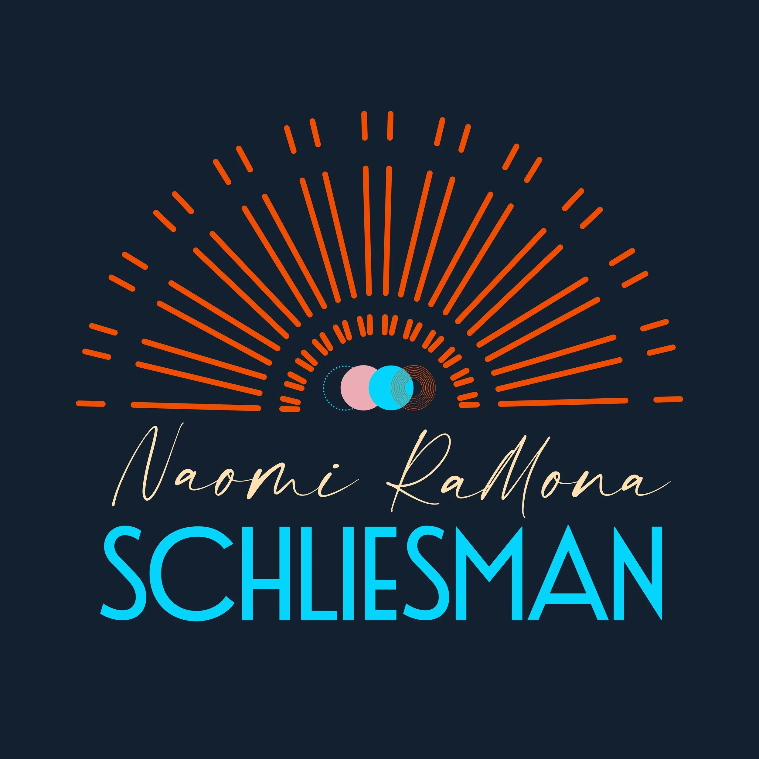
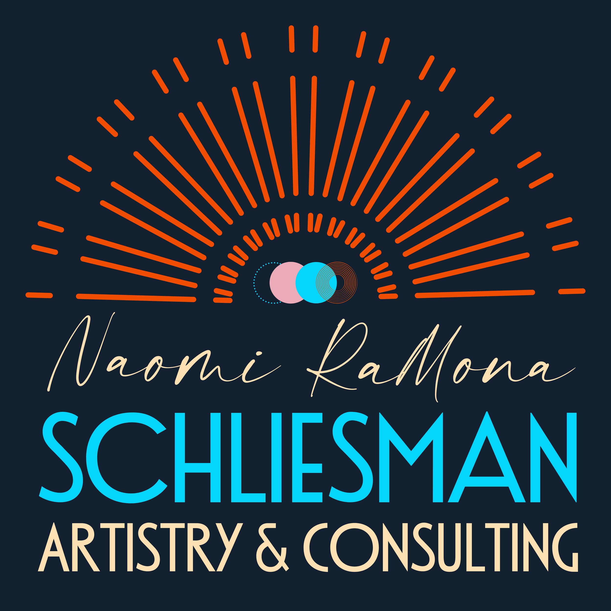
I had the joy of creating a fresh logo + brand palette for my friend and incredibly talented artist, Naomi RaMona Schliesman (@naomi.schliesman).
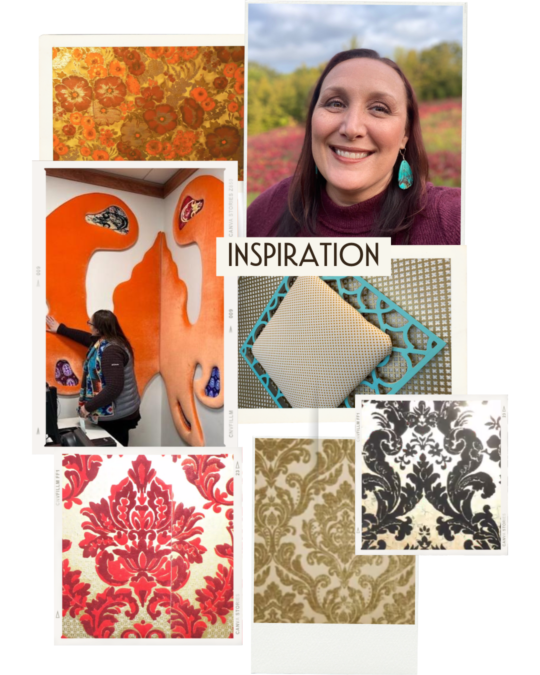
From the very beginning, my goal was to honor Naomi and her ancestors. Her grandparents were artists in their own right and so dear to her — we wanted those threads woven into her visual identity.
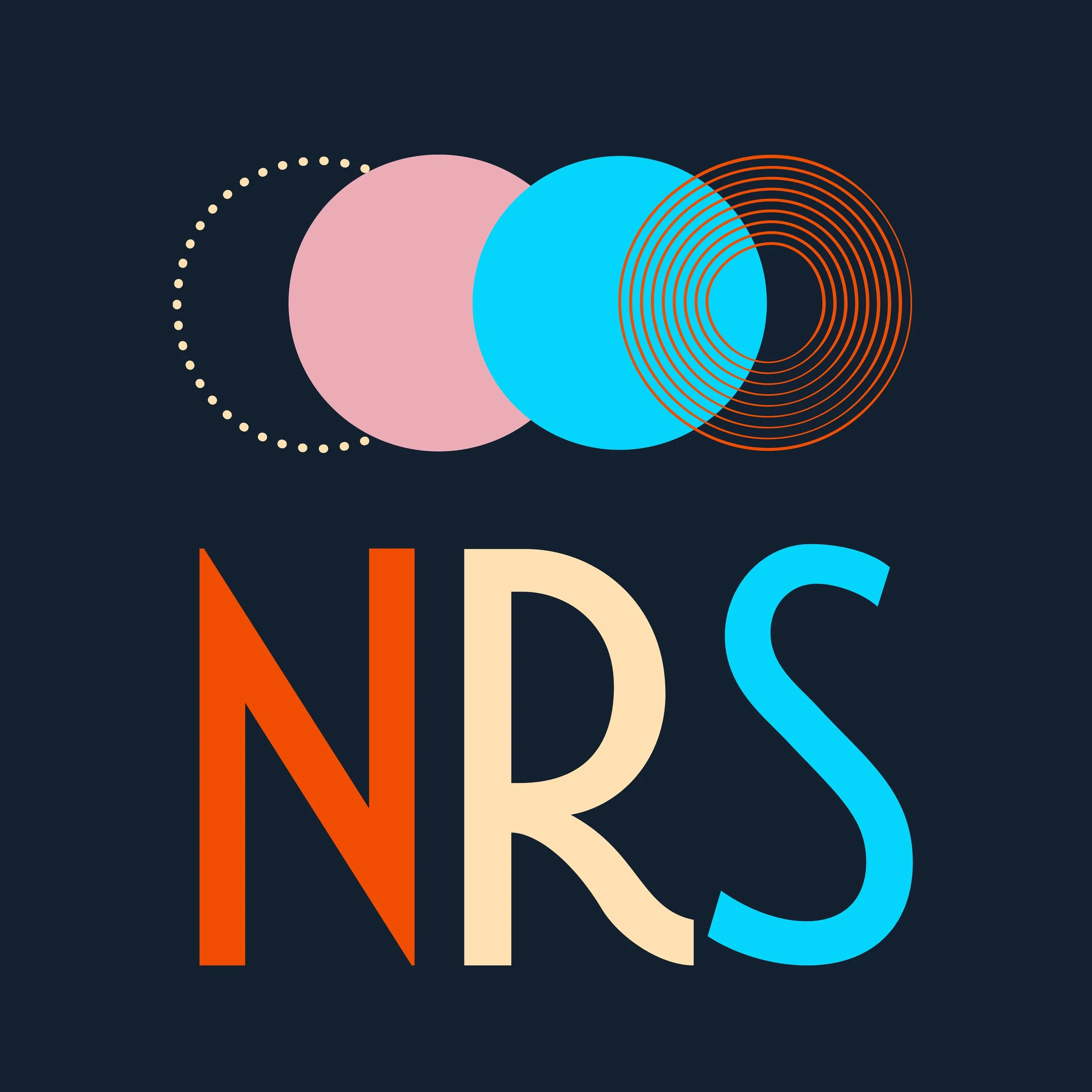
Naomi shared photos of the gorgeous damask wallpaper from her grandma’s house that she always loved. I pulled that inspiration into the palette and font choices. She also asked for circles as a nod to her grandfather, a woodworker who carved them into every piece as his “signature.”
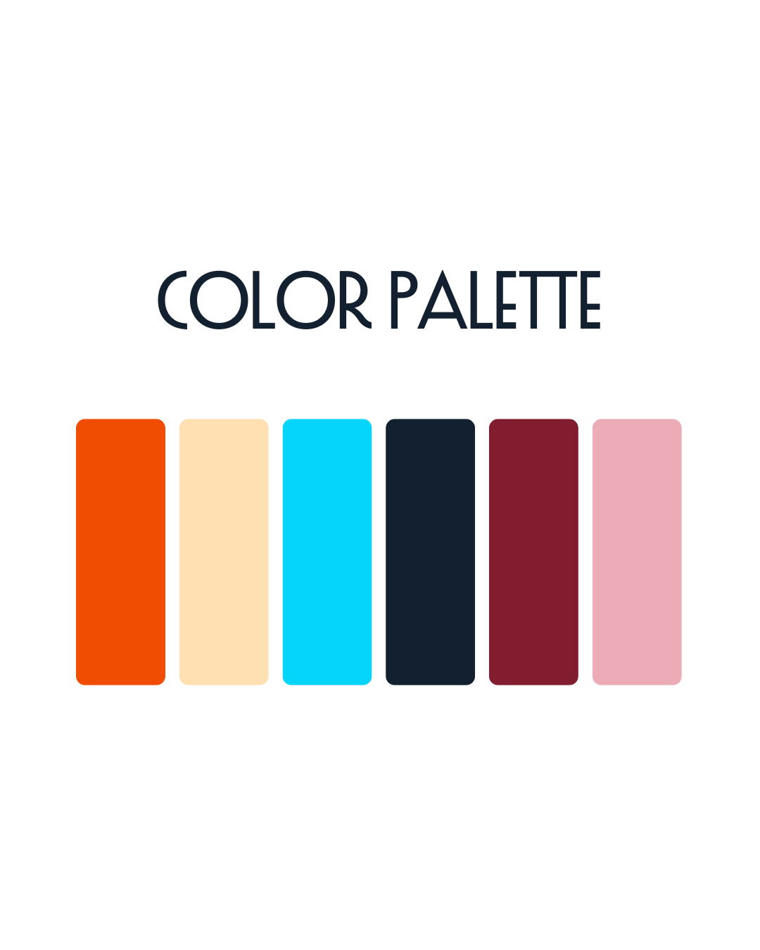
And of course, she dreamed of turquoise + bright orange, with something radiant that evoked “shining” or “glowing.”
The result? A design that carries echoes of Naomi’s heritage (Scandinavian + Native roots), her family legacy, and her artistry. The script font adds a personal touch, while the bold sans serif grounds her professional identity.
When I sent Naomi the color palette, she laughed — they were the exact colors she had just chosen for her new office. Total kismet. ✨
Recently, I had the honor of seeing Naomi’s show Healing Medicine at the Kaddatz Gallery in Fergus Falls with Anna Lee’s (@xomissannalee) Mother Trees group. To walk into that space and see her brilliance alive in every detail — logo, palette, artwork — was deeply moving (yes, I cried 🥹).
Naomi is not only an extraordinary artist but one of the best humans I know. It was a privilege to create something that reflects her light, her legacy, and her incredible presence in the Fergus Falls community. 💛